Function: Dashboard
Precise monitoring and efficient use of resources
This chapter explains the Dashboard function of the DO-1 user interface. Dashboards are a powerful tool for improving data visualization, monitoring and analysis, which in turn can lead to more informed and efficient use of resources. Digital monitoring and visualisation of connected devices by creating individual graphical overviews, one of which can be set as the start page. It is also possible to preview the views that have already been created.
Overview:
Configuration: Creating and editing Dashboards
By clicking Configuration in the submenu it will open the dashboard overview page. This page contains a list view, which then displays the dashboards after you have created them yourself.
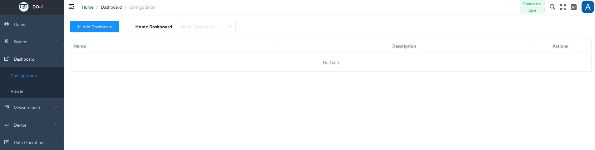
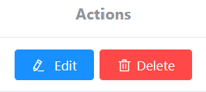
The following actions are available for created dashboards:
| Action | Description |
|---|---|
| Edit | Opens the data entry for editing of the settings. |
| Delete | Removes the order from the system. (A warning notice must also be confirmed) |
Note: Before you can create a new overview, the corresponding devices must be stored in the DO-1. All information on this can be found in the Device chapter.
Add Dashboard
A click on Add Dashboard opens an entry screen. The basic information is stored in the upper part and the desired graphical elements are added in the lower part.
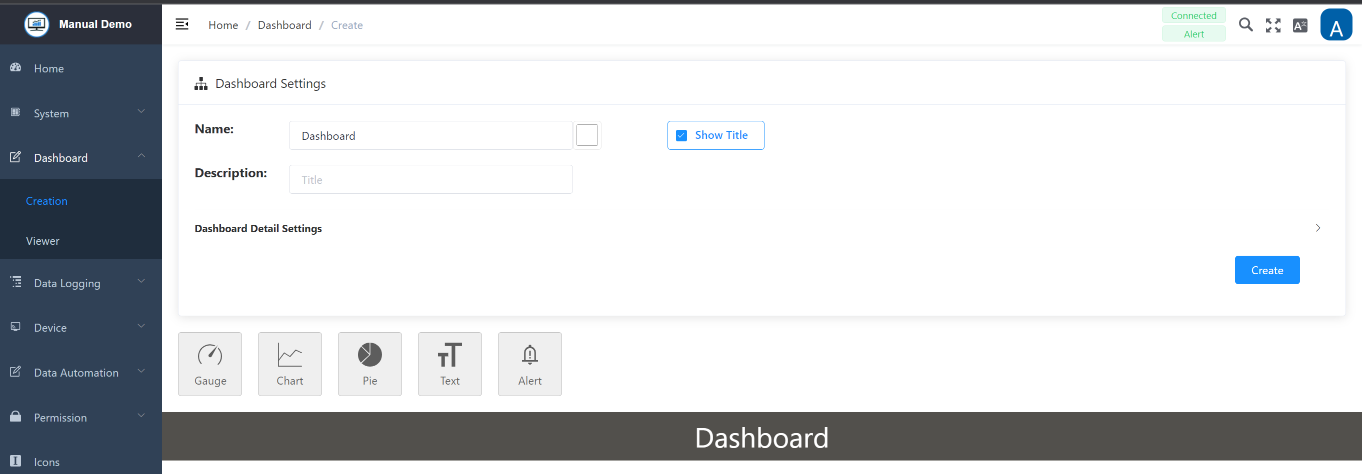
Dashboard Settings
| Field | Description |
|---|---|
| Title | Enter a name for the respective dashboard |
| Color tile | Optional; The RGB color scheme offers the option of assigning a color to the title, clicking on it opens another window for color selection |
| “Show Title” | Optional; Specify whether the title, i.e. the name, should be displayed by clicking on the checkbox to enable/disable it |
| Description | Optional; Any description can be added here, such as detailed information about this specific dashboard and the devices being monitored |
By clicking on Dashboard Detail Settings or the arrow on the right-hand side, the view settings can be displayed and edited. The dashboard graphic is based on a grid view. Changing the values changes the distance between the individual graphic elements. The values are given in pixels. Colors and margins can also be adjusted.
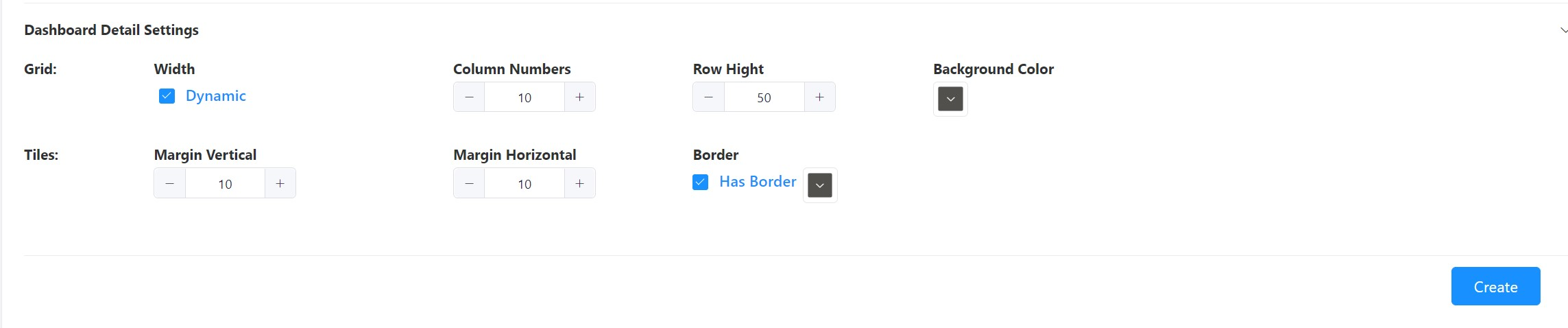
Functionality: Dynamic
If this function is activated, the view is adjusted automatically - alternatively, the size can also be set manually. This function ensures that the view is displayed appropriately on a mobile device.
Once the data has been customized to your needs, click on the Create button to save the dashboard.
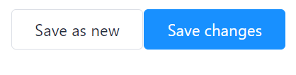
Changes and new creation with existing entries
When making subsequent changes to overviews already created, it is possible to save them or to use the entries made for a new creation. The following buttons appear on the right below the basic input screen instead of Create:
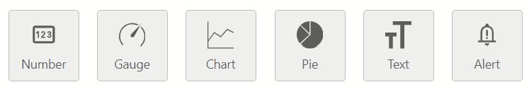
Graphical Elements
A selection of graphical elements is available to display the live data on the dashboard. By clicking on the respective tile, any number of items can be added and selected individually.
Additional functions
In addition to the individual settings of the elements, you can use the following functions directly on the dashboard:
-
Drag & Drop: The added elements are freely movable and can therefore be easily arranged.
-
Determine size directly: The size of the element can be adjusted directly with the mouse:
- Select the bottom right-hand corner of the element with a mouse click or touchpad.
- Hold down the left mouse button or the touchpad and use the pointer to adjust the size to your own requirements.
General item configuration
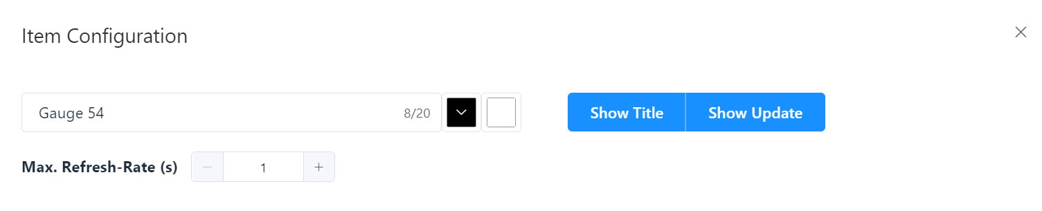
Double-click on one of the added items to open another window with the respective configuration options. The design of the respective element can be customized. The input mask for the respective basic information is usually identical:
Item Configuration – Basic InformationHold down the left mouse button or the touchpad and use the pointer to adjust the size to your own requirements.
| Field | Description |
|---|---|
| Title | Assigning a designation |
| 1. Color tile | Color selection for the title |
| 2. Color tile | Color selection for the background of the element |
| “Show Title” | Optional; specify whether the title, i.e. the name, should be displayed by clicking on the checkbox to enable/disable it |
| “Update Indicator” | Optional; If this function is selected, a colored dot flashes in the top left corner of the element to indicate that the value is being updated. |
| Max. Refresh rate (S) | Optional; definition of the seconds for the value update - This is particularly important in relation to the computing power, depending on the values displayed. This field is not available for the text element! |
Saving, copying and removing elements
In addition to the general information on the element, the following actions are also standardized:
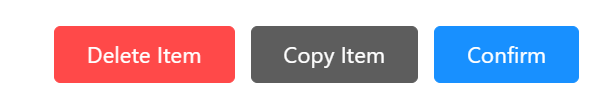
Delete Item: Leads to removal of the element, a warning must be confirmed.
Copy Item: Duplicates the element, which can be helpful when creating further elements.
Confirm: Saves all entries made.
Failure of Devices/Sensors for Measured Value Acquisition
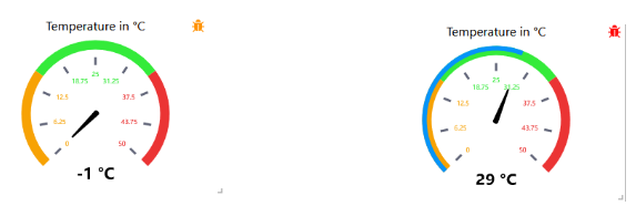
If the “Meter”, “Diagram” or “Circle” display options are selected in the dashboard for a measuring device or sensor and the Modbus simultaneously detects that the corresponding measuring device or sensor is missing or has failed, the following symbol appears in the tile of the respective element at the top right-hand edge.
The following color coding must be distinguished:
- Orange (flashing): No data is being received. Connection must be checked.
- Red (flashing): The device has been removed from the DO-1 system.
2.2 Detail Settings
In addition to the basic information, the graphical layout and the data binding for each element have to be defined or texts can be added. The following section explains the configuration options for all six elements.
Element: Number
This element is used to display measured values digitally. You can decide whether you want to display percentages or other value definitions.
Layout
All graphical details for the number element can be adjusted under Layout. Open the settings in the sub-menu by clicking on the bar or drop-down menu symbol.
Element Number - Layout Settings
-
Text size (px): Individual; Enter a value or use +/- to adjust the size. The value is in pixels.
-
Decimal places: Individual; Enter a value or use +/- to set the decimal places, if necessary.
-
Color:_ Individual_; Set the color for the value by clicking the title and choosing from the color board.
-
Prefix: Individual; Entry before the displayed value.
-
Postfix: Individual; Entry after the displayed value.
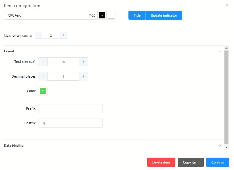
Data Binding
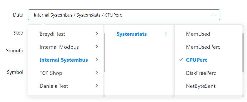
Under Data connection, the corresponding link to the connected devices is defined via a selection menu. All processes of the DO-1 as well as all stored devices, created calculations, and alarms are available in this selection and are thus linked to the element and mapped:
- Click on Data connection or the arrow on the right to display a drop-down menu.
- Click to select the appropriate data link from the drop-down menu.
- By clicking Confirm, all entries are saved.
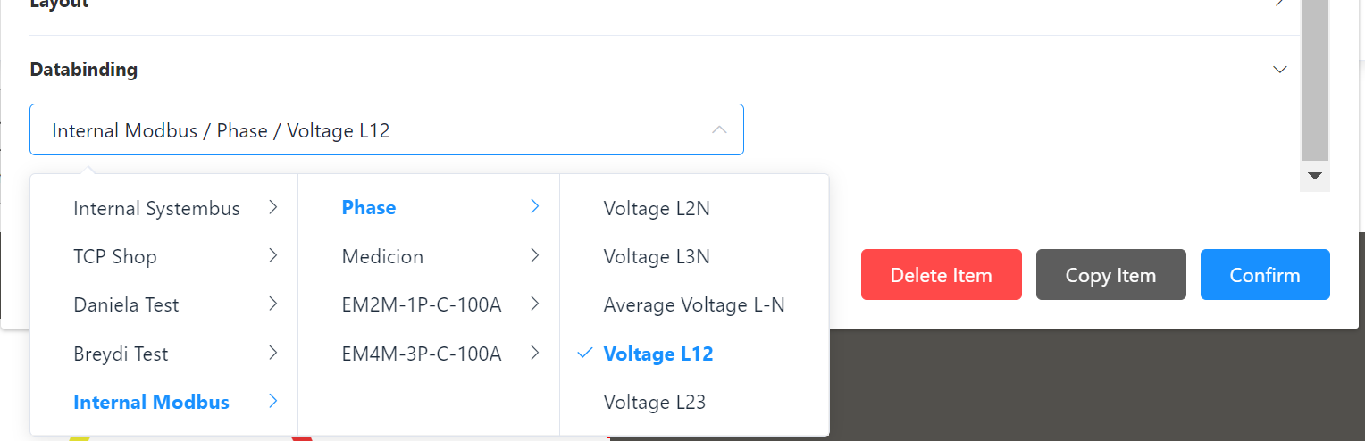
Example Number element:
Element: Gauge
This element is used to display various states or values. The layout can be customized to suit your individual needs.
Layout
Clicking on Layout opens the display settings for the element Gauge. It allows customization of the display and addition of various graphical details.
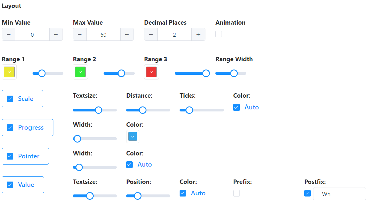
Element Gauge – Layout Settings
-
Values: Min./Max Value adjustment by entering numbers directly or by clicking on +/-; depending on the connected devices and which values are to be displayed.
-
Decimal Places: Definition by direct number input or click on +/-; specification of the decimal places to be displayed.
-
Animation: The animation can be activated/deactivated by ticking the box below.
-
Colors: Range 1, 2, 3; Depending on which values of a connected device are to be displayed, the color range can be enlarged or reduced; range width can be adjusted proportionally using a slider, colors can be individually customized.
-
Range Width: Maximum 20, use the slider to adjust the value.
Detail Elements (to be selected by ticking the corresponding box)
-
Scale: Adjustment of text size, spacing, marker, and color of the scale.
-
Progress: Adjustment of width and color.
-
Pointer: Adjustment of width and color.
-
Value: Adjustment of the text size, position, and desired color. Depending on the connected devices, you can activate the Pre- or Postfix function to display the measured value designation.
Data Binding
The data connection is the same as for the Chart element.
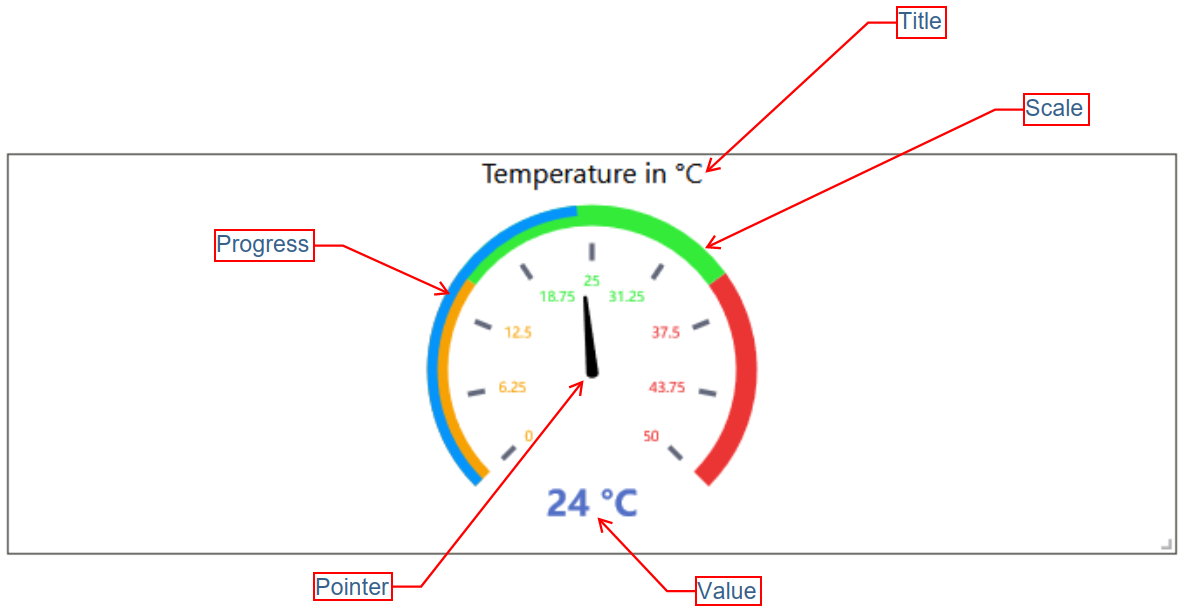
Example Gauge element:
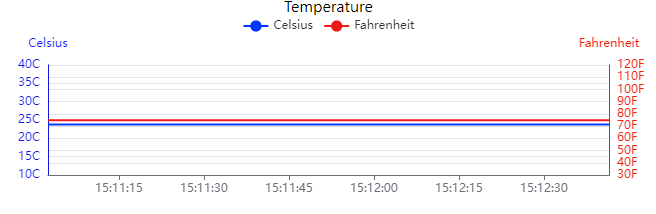
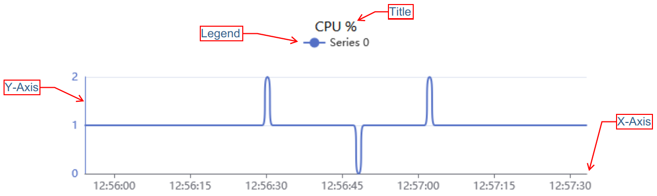
Element: Line Chart
This element is used to display quantitative values over a specified time interval. The layout can be customized to suit your individual needs.
Layout
All graphical details for the diagram element can be adjusted under Layout. To edit the basic settings, the respective sub-items (General, X-axis, Y-axis) must be expanded by clicking on each of them. Within the area General, further options can be added to the view in the element.
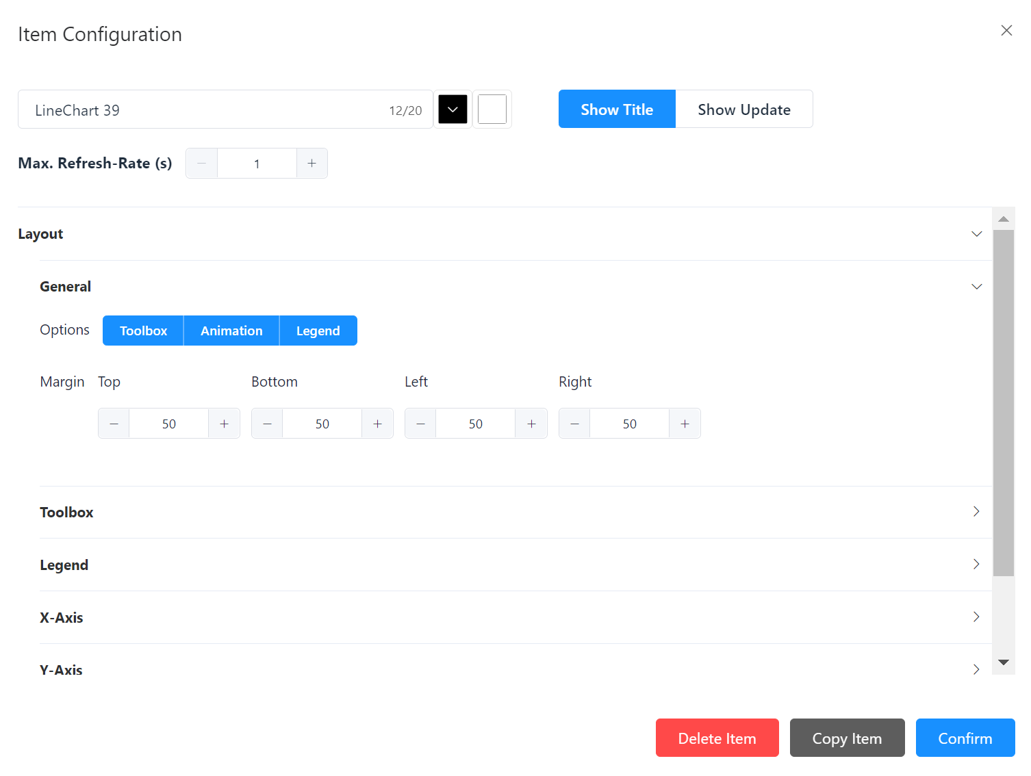
Element Line Chart – Layout Settings
-
General: Options: Toolbar, Animation (in the element), Legend, Margin: Definition of the margins of the diagram, values in pixels.
-
Toolbar: Defining the position in the element. Appears when Toolbar has been selected under General options.
-
Legend: Defining the position in the element. Appears when Legend has been selected under General options.
-
X-Axis: Definition of the date and time format and the axis division.
-
Y-Axis: Up to two axes can be added to the view; two separate y-axes are placed on the left and right side of the chart, where each axis can represent different units of measurement. This makes it possible to display two different data sets with different value ranges in one diagram.
Data Binding
The series to be displayed in the diagram are defined under data binding. These series reflect the data from the corresponding source. Any number of series can be added.
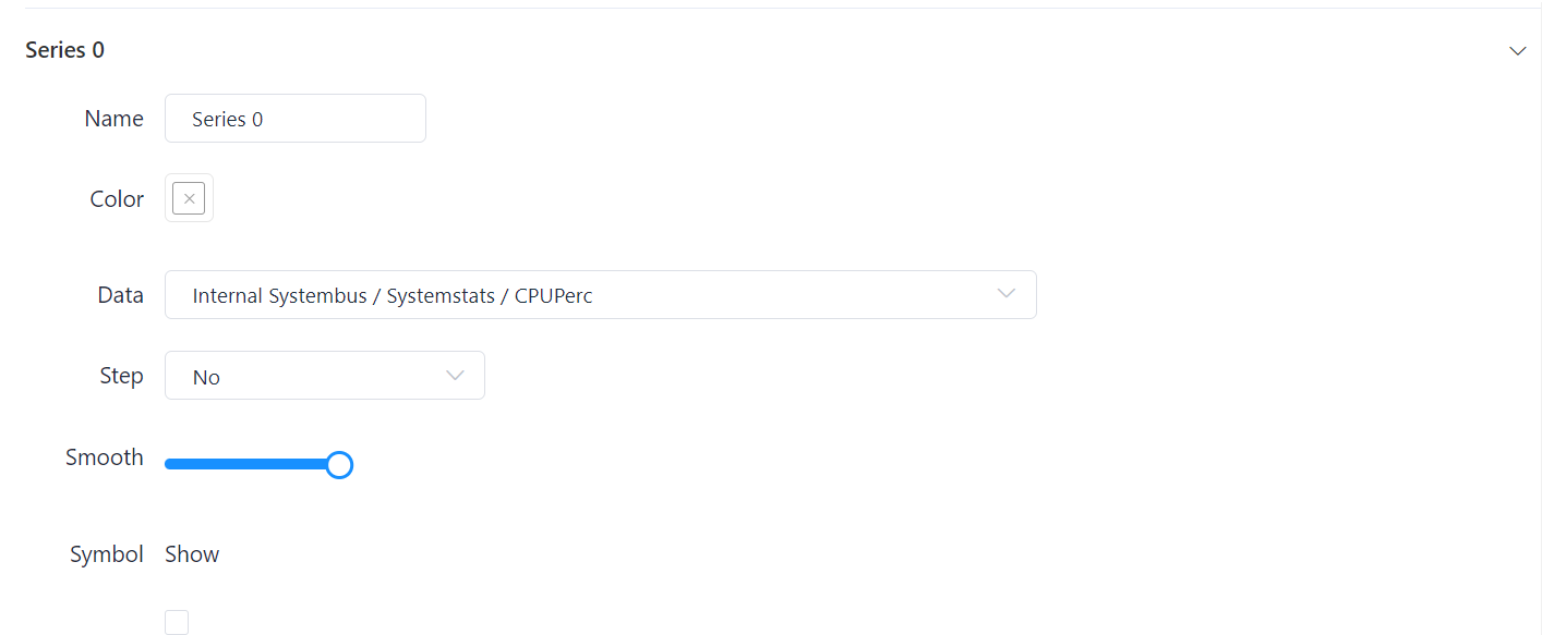
Element Line Chart - Series Settings
-
Name: Assigning a designation.
-
Color tile: Automatically preset, the color can be changed as desired by clicking on the tile.
-
Data: Drop-down selection menu, click to select the corresponding data source.
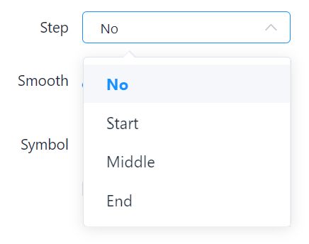
- Step: Determining the step change.
-
Smooth: Set the degree of smoothing using the slider (Interpolation - a curve with a lower curvature).
-
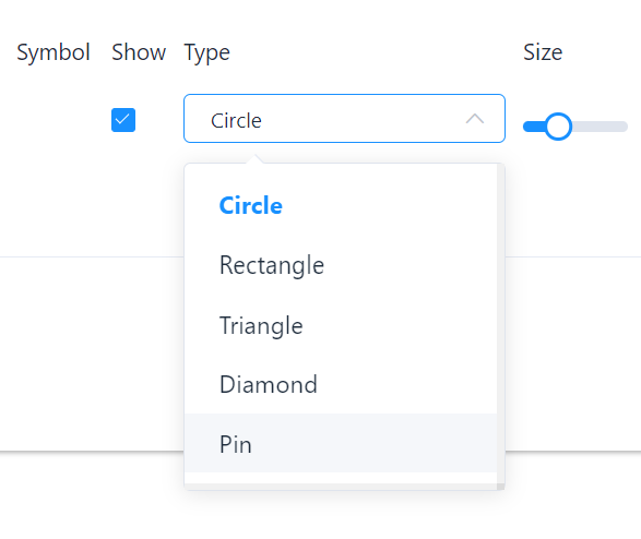
Symbol: Optional, Box activates drop-down selection; various shapes to choose from.
Each series can be deleted again by clicking Remove series. All entries made are then saved by clicking on Confirm.
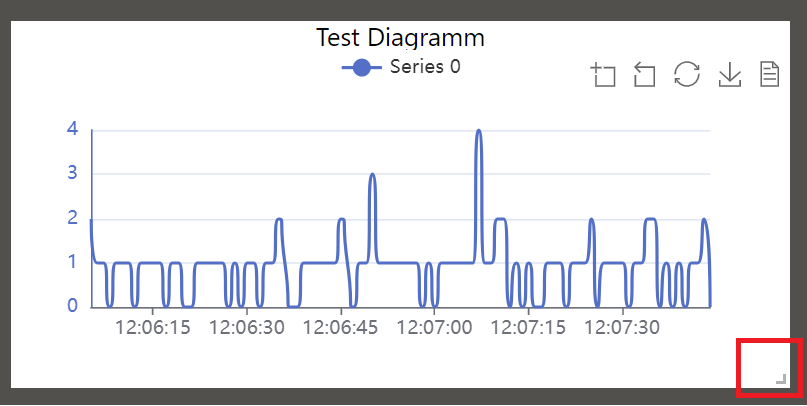
Example Line Chart element:
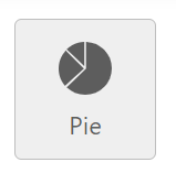
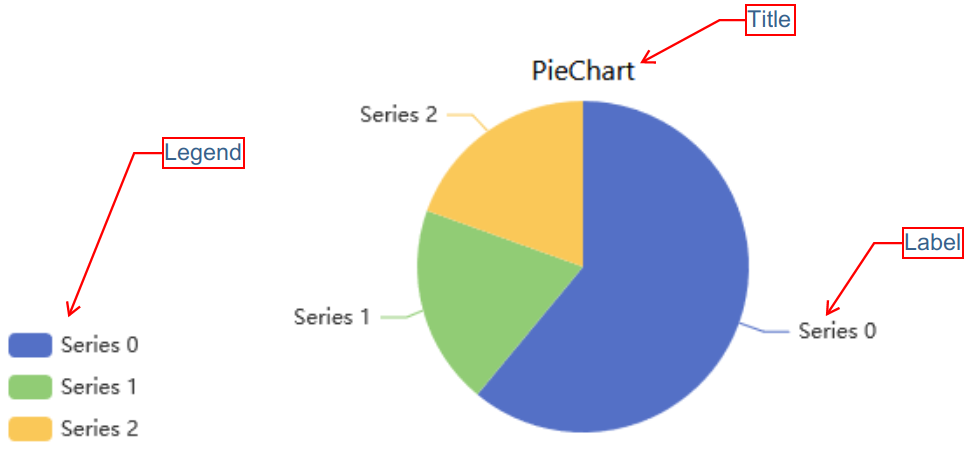
Element: Pie Chart
This element is used to show a parts-to-whole relationship for categorical data, including ordinal and nominal data. The layout can be customized to suit your individual needs.
Layout
All graphical details for the pie chart can be adjusted under Layout. To edit the settings, the general sub-item must be expanded by clicking on it. Further view options can be added with a mouse click.
Element Pie Chart - Layout Settings
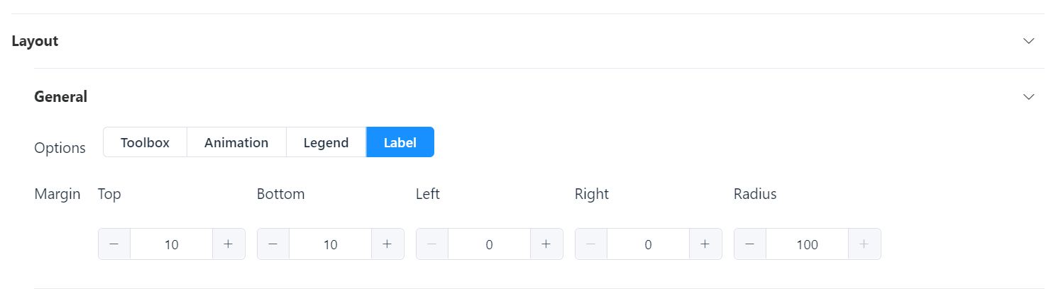
-
General: Options can be activated with a click. Toolbox, Legend - if active, then highlighted in blue. Further setting options appear below when selected.
-
Animation: If active, a flowing and continuous visualization of the value changes is displayed in the graphical representation.
-
Label: If active, the name of the respective area is displayed in the graphical representation on the dashboard.
-
Margin: Setting the limit of the pie chart, values in pixels, set via +/- or enter the number yourself.
Data Binding
The data connection is the same as for the Line Chart element.
Example Pie Chart element:
Element: Text Box
This element is used to display all kinds of text entries on a dashboard. The layout can be customized to suit your individual needs.
The Text element contains an editor tool that can be used in a similar way to Microsoft Word to display descriptions, lists, images, links, etc.
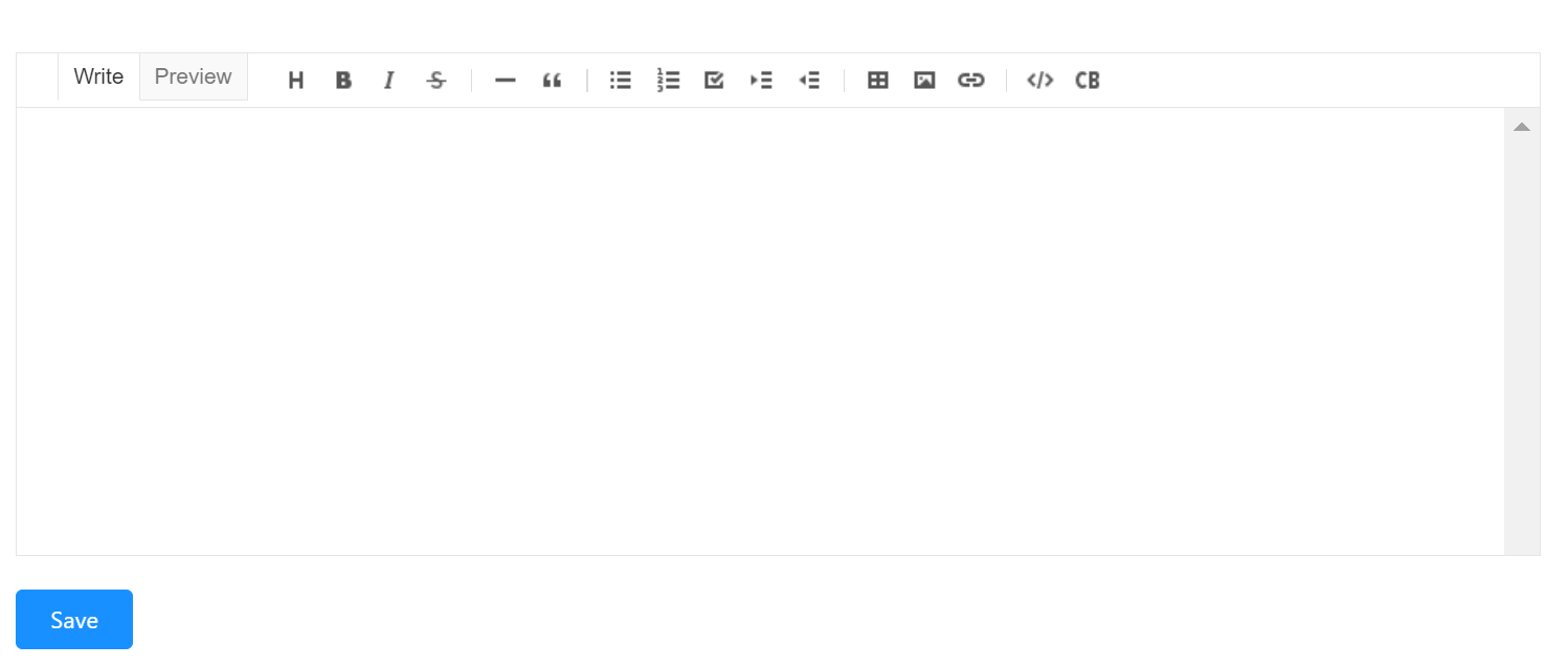
You can write or insert texts and have various functions available in the menu bar of the text box. Among other things, you can display the text size, bold, italics, or even strikethrough text. You can highlight quotes, key points, step sequences, or even display a task list. Tables and images can be inserted. Alternatively, you can also write in a programming language.
Example Text element:

Element: Alert
This element is used to display the occurring alerts on the dashboard. The layout can be customized to suit your individual needs.
Layout
All graphical view details for the Alarm element can be adjusted under Layout. To edit the settings, the submenu must be expanded by clicking on it. Further table options can be added by ticking the corresponding boxes.
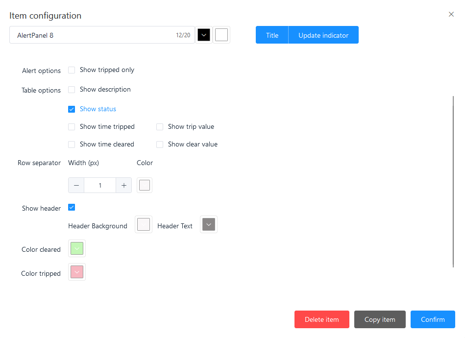
Element Alert – Layout Settings
-
Alert Option: View option can be selected by ticking the checkbox - “Show tripped only”; then alerts are displayed when they are tripped.
-
Table Options: Various view options can be added by activating the checkbox: “Show description”, “Show Status”, “Show time tripped”, “Show trip value”, “Show time cleared”, “Show clear value”.
-
Row Separator: Definition of the spacing between the individual lines, values in pixels. Color can be adjusted individually via the function of the box.
-
Header: By ticking the checkbox, the title of the element is displayed on the dashboard, and the color of the letters and the background can also be adjusted by clicking on the corresponding color box.
Data Binding
Under Data binding, you can add the alerts stored in the system that you want to display in the element on the dashboard. To do this, click to show the area and click to add the desired alerts.
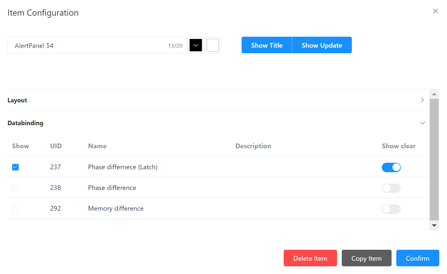
Element Alert – Data Binding
-
Show: Selection of the alarm message to be displayed in the element on the display panel.
-
UID: Code number of the created alert.
-
Name: Title of the created alert.
-
Description: If a description has been entered, this is also displayed.
-
Display delete function: Activation via digital slide control; it is possible to add a delete function for the respective alarm to the element in the dashboard.
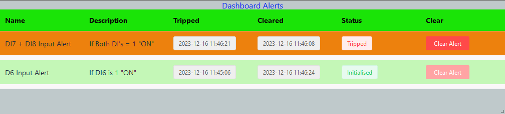
Example Alert element:
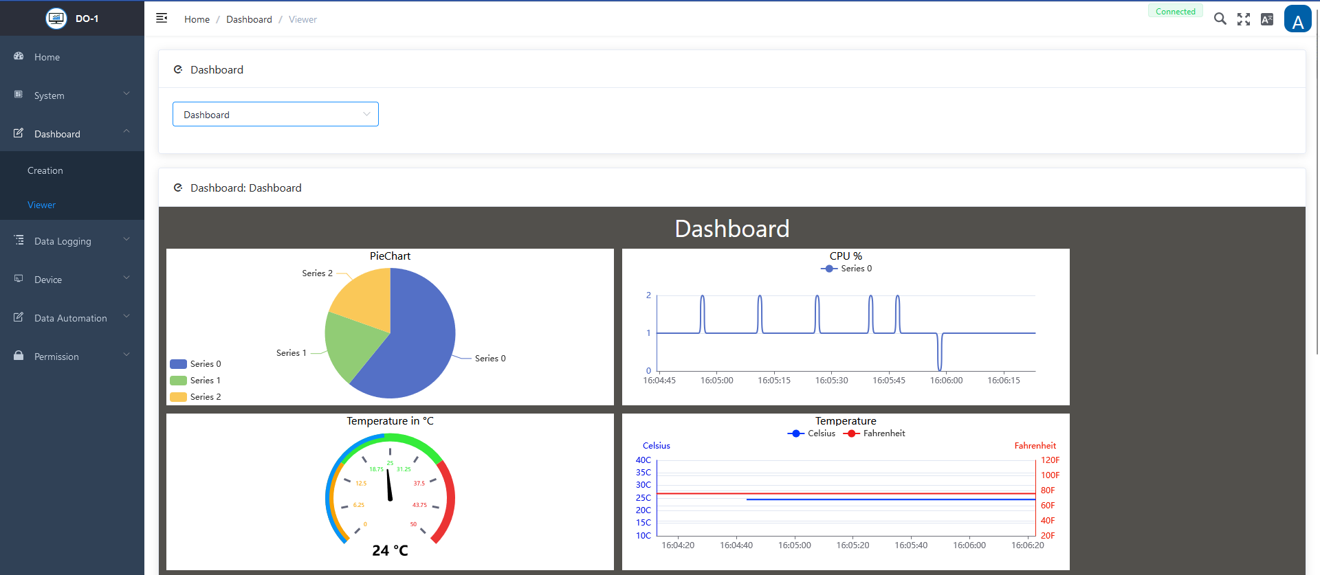
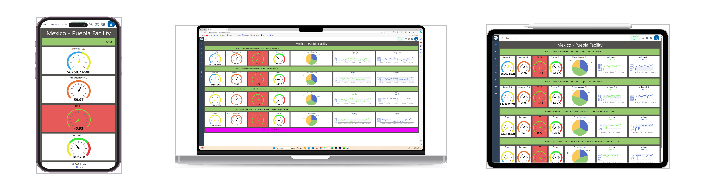
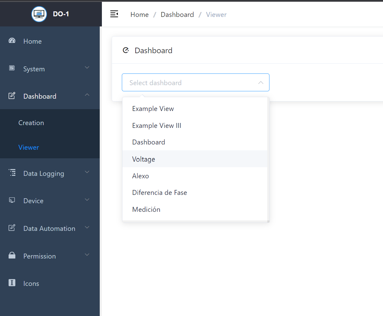
Viewer: Preview of the Created Dashboards
As soon as a new dashboard has been created, the corresponding dashboard can be selected for preview via a drop-down menu. This provides a quick insight into the appearance and arrangement of the graphical elements. The preview function helps to check whether the overviews meet expectations before they are shared with other users or set as the start page.
Example View